Recordbox's UI
Table of Contents
Recordbox will be undergoing a face-lift (hopefully) soon. Because I do not have the time to actually finish said face-lift yet, and because I still really want to keep working on it despite this, I’ve decide I’ll compromise and write a long rambling post about the changes and do some general reflection on the design decisions that have lead up to this update instead.
To start off, many of the random issues I ran into along the course of this project could have most likely been avoided if I had done some more design work at the beginning, but alas I am not a UI designer and chose to wing it, so I had to learn the hard way. One thing’s for sure though: I know a lot more about UI design than when I started. Am I an expert? Resounding NOPE, but compared to previous projects this is my best yet in terms of UI, so that’s a big win in my book :)
The History #
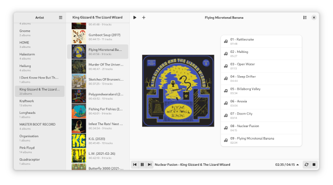
The original design for Recordbox, which went through several iterations to arrive at the point it is at now before this new update, was based around the three-tier navigation hierarchy of artist->album->tracks, that basically worked like miller-columns. I really like this system from other players like Quod Libet and Rhythmbox, but I wanted more prominent album art and a simpler interface. Basically, the original design was “what if I extract out the navigation style of Quod Libet and Rythmbox and shove it in an interface similar to Amberol and Gapless?”. In implementing this, I got as far as the three-tiers of navigation before hitting a problem:
Where exactly was I going to put the player? #
At this point the interface looked mostly like this:1

On getting to this point, I realized I had no idea where I was going to put the actual player view because I had designed the entire UI exclusively around browsing the music, completely skipping over the fact that it also had to play the music. Of course, you can also see in this picture the solution: put the player in a bar at the bottom that slides out when a song starts playing. It was a pretty good solution, and has gotten the project this far, but it was always a bit weird, and lead to some confusing things about the UI that I spent the next several updates smoothing out, but I don’t think they ever went away.
Most of the confusion arises from the fact that that having the player as a bar at the bottom kind of implies that the album above it is what is being played. The thing is, it’s not. This has been the biggest dilemma with this UI that I only now realize after changing it how much of an impact it had. The album view, in every release of Recordbox, has always shown the album selected in the album list. Nothing else. The fact that it shows the album that happens to be playing is just a coincidence from the fact that you have to navigate to the album to play it. You can navigate off the album while it is playing and have a different album be there.
A lot of strange stuff came from this because I kept running into little design decisions that would seem obvious, but because of this UI choice they ended up being rather annoying. Like, where do I put the button to play the album being shown? In another UI, this would be easy, but you can already see the problem in the above screenshot of the first release: there’s two play buttons. People who I showed Recordbox to would keep clicking the play button in the top bar, indenting to play the song that was currently paused, and play whatever album was shown from the beginning instead. The iteration of Recordbox in the most recent release where the play button for the albums was on top of the album cover was the best solution I eventually came up with, but brought it’s own problems.
The Play Queue #
The second problem arose with adding the play queue, and once again, it was because I didn’t have anywhere to put it. Like with the player view, because I had only planned out as far as the library and album view, I didn’t know where I was going to put anything else. Since I didn’t want to change the layout everything kept getting tacked on where it would fit.
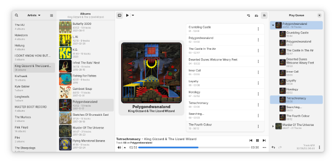
So it ended up in a right-hand sidebar, which was surprisingly annoying. Adaptive sidebars look bad on the right side of the window; if they are top-level with their own header—and collapsed—the window controls move into the sidebar’s header when it is opened, which I always found confusing. I kept finding myself thinking it would close the sidebar when it still closed the whole window. Moving it to be inside the main content view—without it’s own header bar—fixes this, but I found it to look quite ugly when not collapsed. This resulted in the sidebar having to be hot-swapped between the two layouts when the window size changed. This wasn’t too hard to do, but the breakpoint thresholds were a nightmare to configure right so sidebars didn’t keep collapsing and then expanding multiple times as the window dimensions changed. (When the library collapsed, the queue would pop back in, or vice-versa. Other values would have the album view go in and out of it’s vertical layout three times as different panels collapsed. ugh, not fun)
The other problem that arose from this is that if the panel containing the queue was collapsed, (like in the above screenshot) it really wasn’t that obvious that it was there. I would make changes over time to try to address this, like adding toasts with an action to open the queue which popped up when adding songs to it, but they still didn’t fully address the problem. For a few releases I even had the queue expanded by default, but it meant the full-size layout was really wide and I ended up deciding that having both the album view track list and queue right next to each other had the opposite problem of being a bit too much stuff at once, so I changed it back.2

Having the queue collapsed wasn’t the root of problem in my opinion, however. The reason it wasn’t discoverable is because the album view’s track list looked like a play queue. In fact, that’s kind of how Quod Libet and Rythmbox do it. In both players, the most prominent list contains all the tracks in the library and selecting in the other lists filters it by the item selected. The player then plays through the songs that are visible in the list. Now, I haven’t use Rythmbox in a while, so I can’t speak for it, but in Quod Libet, an important thing to note is that when you switch what is shown in the track list, the player starts playing from what is shown. That is, if you are playing the album “Polygondwanaland”, and you decide to browse other albums and click on “Changes”, the next song that plays will be the first song on “Changes”, not the next song on “Polygondwanaland”.3 It makes sense that it works this way because Quod Libet is playing from that list. Recordbox doesn’t, it always plays only from the play queue. Switching the visible album in the album view doesn’t change what will play next. But it looks like it does. Because when you play an album the player pops up and starts playing the first song. Now when you switch to a different album and it keeps playing, you’ll find out that it’s not playing from that list and there must be a play queue, (if you hadn’t found it yet) but it still looks like a play queue. Leading to scenarios like this:
- You are playing some albums and/or songs with Recordbox, such that there is more than just one album in the queue.
- The currently playing album is the one shown in the album view.
- You decide you want to jump to a different track in the currently playing album
- You click on the track in the album view’s track list, because it’s much more prominent than the queue, and even kind of looks like one.
- Recordbox will consider this as you playing a new album and will clear the queue and replace it with the newly played album. Since this is the same one that was already playing, it doesn’t look like anything changed, but every other item in the queue other than that album is now gone and you can’t undo.
Now, how to address this with the design as-is? There are some options:
- Put up a warning dialog every time the user plays an album with other albums in the queue. I tried this, it gets really annoying having a dialog popup constantly if you are being indecisive and keep switching between playing different albums.4
- Allow undoing the operation made to the queue. This gets really weird very fast because it runs into problems of whether the player should automatically switch back to playing the song from before, which would be inconsistent with how undo works in every other situation and require saving the player state, and if it doesn’t switch when undoing its still a weird edge case because the undo will move the current index back one, meaning the new song plays twice.5 Overall, an astonishing amount of edge cases and opportunities for bugs arises here.
- When playing a song in an album, check if the album already exists in the queue and jump to it. This would probably be the least weird option, but it still runs into edge cases, like how the same album can be added more than once, and then which one do you jump to, and also it’s just burying the play queue more because that’s one less reason to open it.
What these all have in common, is that they are all bandaids over the root cause; none of them fix the underlying problem that the album view looks like it is the primary way to do actions that are supposed to be done in the play queue, which is much less prominent.
Lack Of Unification #
Lots of other random small issues kept cropping up, like the lyrics being shoved into the album view because there wasn’t anywhere else to put them, weird settings I kept adding to try to address things which made them more confusing instead, etc. All of these stemmed from the fact that the album view took up a lot of space for what it did and everything was kind of fit around the original design from 0.1.0 rather than truly building on it. Everything was a bit disjointed as a result. To some, maybe even a lot of people—myself included—it didn’t outwardly come across that way, and I’d credit a lot of that to Libadwaita making it look nice enough to hide some of that, but as the person who’s also been working on it this whole time it started feeling very restrictive and messy behind the scenes. Not because the code was bad, I’ve been really cleaning up the spaghetti code that plagued some parts of the code base, but because the UI layout was hard to work with and decisions about new features were getting hard to make because of it.
Basically, it came down to this:
- The album view was too prominent and taking up too much space.
- The play queue was not prominent enough.
- The player bar at the bottom made the album view feel like part of the player while songs were playing, but it wasn’t.
- The album view was essentially serving a dual purpose, being both the only way of viewing albums while browsing the library and the primary way of showing the currently playing album/track.
- All new features, like lyrics, search, switching between artists and genres in the left-most list, etc, were being put in different places, and the code base was getting unwieldy as a result. Every new feature basically required a new unique layout and special accommodations.
This of course, leads into the second part of the post: what I did to fix all this.
The Update #
Following all this, during the most recent Christmas break I was randomly messing around a bit and I suddenly had a thought pop into my head for a change I could make to the UI. I wasn’t directly thinking about any of the previous concerns I brought up in the last section, but after implementing it and experimenting more I realized it’s potential and ended up extrapolating out even more changes that ultimately led to effective all of my complaints with the old UI being resolved. The only complaint I have with the new one is the small trade-off of having to change a core part of the UI that I wanted to keep the way it was, but I have to admit that it was worth the change.
Improved View Switching #
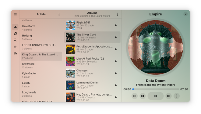
The primary inspiration that the rest of the changes built upon, and the idea that popped into my head over the break, was the introduction of a vertical sidebar on the left of the window, inspired by that of Wike’s. This fixed many of the limitations with the old design, as all secondary views could be merged into a single sidebar, and vastly improved the UI space I had to work with. This allowed for three important improvements:
- The play queue is no longer awkwardly shoved into a 4th panel on the right side of the window and is much more prominent, which addressed about 80% of the problems with the play queue that I’ve mentioned.
- Search was moved out of the dialog, which was great, as the only reason it was in one in the first place is because once again I couldn’t figure out where to put it otherwise. This also led to some improvements to the page that helped to integrate it more with the rest of the UI.
- The lyrics could be put in the sidebar, which really is a much better place for them because there’s (again) more space, so the window can get a lot smaller before lines start wrapping.
In short, the introduction of the navigation sidebar on the left solved most of point 2. and entirely solved point 5. from earlier.
Of course, this leads to the other major improvement that I stumbled into following this change, which lead to all the other points being effectively solved as well.
A New Player View #
After adding the navigation panel and moving everything I could into the sidebar, I got the itch to try to put a proper player view in again, because now that the play queue was in the left sidebar I found myself wanting to have one to go next to it. Having the sidebar showing the play queue next to the album view felt a bit strange, and I wanted to fix points 2-3 by having the album view associated only with the library view and a new player view to associate with the queue. Then, when a song is playing, the user will be on the player view, not the album view, so if they wanted to switch songs or do play-queue related actions, the play queue would be the more convenient option. At first, I tried to add one in the same space as the album view, as that was the logical place to put it, and I once again ran into the same problem I ran into so may times before: the album view was always in the way. I tried using a stack switcher that swapped between the album view and player view depending on what view was selected in the sidebar, but this was annoying and finicky to use and just didn’t feel right. After some thought and frustrated experimentation where I was starting to think all the changes I had already made weren’t going to work after all, I finally settled on what I had to do.
I was going to have to move the album view #
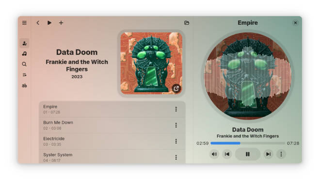
When I first did it, I just quickly yanked the album view out of where it was and just plopped it down on top of the library view so it would open in the sidebar when clicking on an album. This is what I ended up going with, but it looked kind of janky and I was unsure of it, but after working on it more and cleaning it up everything started to fall into place and I managed to readjust the proportions of various widgets a bit and settled on a design for the player view I like and it started to look really good. After a fair bit of messing around and rewriting a bunch of code I had realized that the change actually fixed all the problems I was having. Now that the album view only opened in the sidebar on top of the library (or the search page, as I added a bit later) it didn’t conflict with the play queue at all, or at least, conflicts way less. After this I also ended up reorganizing the album view’s layout because I realized that I wasn’t constrained by the amount of vertical space anymore with it being in the sidebar. This resulted in a new design which keeps almost everything I wanted from the original design while just generally being way better. It also ended up with a new music visualizer because I couldn’t resist adding some superfluous special effects.


The one thing that I didn’t want to change was moving the album view, because it was part of the original three-tier navigation idea I had way back when I started the project. Now you can’t just click though the album list to view different albums; the album view opens every time you click an album and you have to close it to view the next. This was some thing that bugged me in other players, because I like just clicking randomly through my library like that, but I have to admit that loosing this ability was absolutely worth the cost. Having the album view in the sidebar freed so much space for the new fancy player view, which looks way better than the old bottom bar in my opinion, and also freed space in the album view itself so it also looks better than it used to. In fact, I also was able to widen the sidebar, because the player view is less wide than the old album view, so every other panel in the sidebar has more space now too. The adaptive layouts look much better now too, and it just generally adapts to various screen sizes better than the old one. One other compromise that had to be made is that I had to disable multi-selection in the album list, and in the artist-list in the collapsed layout, because it interfered with navigation. I don’t think this will be gone for good though, I’m probably going to work on adding a toggle-able mode for multi-selection in a future update.
Overall, I’m very happy with this new update, and really annoyed that I
don’t have time to finish it. The one thing holding it back is I really,
really need to untangle the last and greatest mountain of spaghetti code: the
play queue. Most of the other code in Recordbox is—I think—pretty good. Most
of the other “spaghetti” wasn’t that bad, and I only really called it spaghetti
because I hadn’t fully worked out the best solution yet. But the play queue is
something else, all the functionality—editing, undo/redo, shuffle, etc—is
hopelessly entwined together, to the point that almost every function in the
queue model is intersecting with like 5 different systems. It’s a disaster,
turns out wanting to have an editable queue that’s stored and displayed as a
tree but needs to be traversed as a flat list of only tracks (so the top-level
album items need to be filtered out/skipped for the player, but not in the UI)
while also supporting undo/redo operations and allowing for shuffle that can
shuffle either albums or tracks—in which case the flattened queue is passed
through while still needing to be treated as a tree because new albums can be
added while shuffled—is really complicated. Luckily I have been making
good progress on separating out the various components into their own
GListModel implementations which can be layered on top of each other, so each
layer only deals with one piece of functionality, rather than one list model
doing everything. It’s just stalled recently because I have another
project I have to do for one of my classes that has taken over the time I had to
work on Recordbox. Also got to make drag-and-drop better.
I could put this off to a later release and just put the current UI changes out now, as they are pretty well stabilized at this point, but I’ve done that for 2 releases now and I really should actually do it.
Anyway that’s what’s going on with Recordbox right now. Hope to be providing
more updates in the future, and am really hopefully going to have time to get
0.9.3 out soon, it’s got like 2 bugfixes and a translation in it, but I just
have not had time to get around to doing the actual release. Was going to do it
this week but then got sick which threw those plans out the window.
But yeah, that’s the rant.
- Emmett
-
Technically, at this point it wouldn’t have had the player bar at the bottom yet, because at the point I’m talking about I was still thinking about where to put the player, but I don’t have screenshots that far back. ↩︎
-
I actually did quite like this layout, but after submitting Recordbox to Flathub and comparing it to other applications I also felt that it was starting to make Recordbox look like it was more complex/power-usery than I was designing it to be, so I collapsed the queue again in response. It was kind of a reflexive “don’t start making this more complex than you can handle” with a bit of slippery-slope- allacy thrown in for good measure. ↩︎
-
This was actually the major pain point I had with Quod Libet that was one of the motivating factors in creating Recordbox. It makes sense why, but as someone who likes randomly clicking on other albums and artists while something is playing, the song switching to the wrong one would drive me nuts. ↩︎
-
You could make the popup show up only if more than one album is in the queue, but I didn’t think of that until writing this post, so the point is moot now. I could still add that in the future though if I decide its worth it, once the new UI’s been broken in a bit and it’s own quirks are found. ↩︎
-
Undo/redo in the queue ended up being surprisingly complicated, the implementation I settled on moves the current index back to wherever it was when the change was made, because after lots of experimentation I decided it was the least weird. It’s still a bit weird, but the other ideas I tried were more weird. ↩︎